
I always find it interesting to keep an eye on the Pantene color report. It gives a glimpse at fashion trends to come...especially in terms of color. And I just adore color!
Here is what they are saying for spring 2009: A summary of the top Spring 2009 colors to be found in the report are:
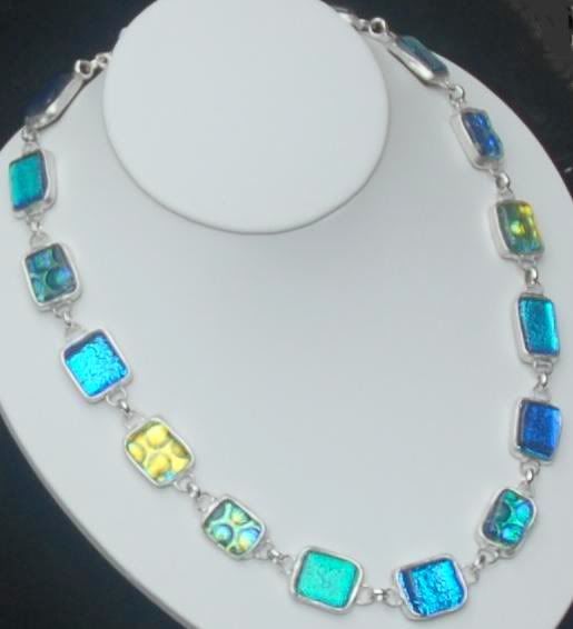
The Blue Hues
Palace Blue — a favorite amongst designers which takes a navy undertone and makes it sparkle. A cross between a sky blue and strong navy. This is a color which works with almost any other, pink, yellow, lavender or green.
Lavender — the regal purple of fall has been adapted to a softer lighter lilac, feminine and romantic, and slightly mystical.
Rose Dust — a pale pinky blue, which is a welcome break from traditional neutrals. Almost a white-washed lavender, this is one of the coolest colors.
Slate Gray — a cool and calming nuanced neutral which provides a backdrop to any of Pantone’s 9 other colors and is a perfect pairing to lavender hues.
The Red Hues
Fuchsia Red –—Vibrant yet seductive, powerful and robust. Fresh and dazzling, fuchsia features heavily in nail polish and lipsticks too.
Salmon Rose — Mixing a soft salmon pink with the subtleness of oranges which is flattering to most complexions and gives a warm healthy glow.
The Green Hues
Vibrant Green — a mossy mid-green which is bright but not harsh
Dark Citron — a calm, almost olive color which blends perfectly with this season’s lemon tones.
Lucite Green — a clean, subtle, soft green which adds a slight shimmer
Yellow
Super Lemon — brings a fun, optimistic outlook to the Palette,” states the Pantone Spring 2009 report. “Its luminosity is determined to evoke a smile and attract the roving consumer’s eyes.”


No comments:
Post a Comment