
Well, it has been a while since I have blogged. It is just so hard to find time during the summer. I just don't want to be indoors if possible. But, fall is just around the corner and as always the fashion industry is thinking ahead.
It looks like brown is going to be the staple this year. The "new" black, so to speak. But, when I want to know for sure, I always defer to the expert: Pantone. Pantone is is the world-renowned authority on color, so what they say goes.
So, here is what they are saying (taken directly from Pantone's Color Report for 2007):
Complex and exotic describe the intriguingly unusual and inviting color palette for fall ‘07. The traditional neutral shades expected for autumn have been replaced this season with rich, nuanced hues, offering more opportunity for creativity with interesting and unexpected color combinations.
Spicy Chili Pepper and exotic Lemon Curry stimulate the taste buds, entice the senses and enliven any wardrobe. Purple Wine, the ultimate expression of creativity, marries purple and wine, broadening the appeal of purple for fashion. The violet undertones of Dusk give gray a whole new dimension, making this fall’s neutral much more desirable. Carafe, a deep, espresso brown, adds contrast to the palette, providing a rich alternative to the usual black or charcoal.
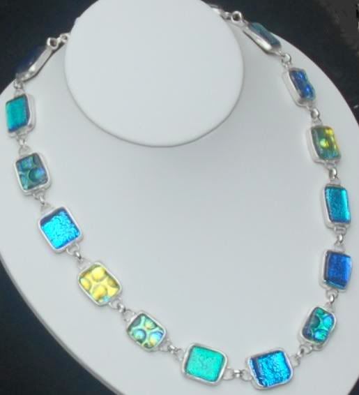
Sumptuous Cashmere Rose is not only the perfect complement to any of fall’s colors, but also flatters any complexion. Many seasons have paid homage to nature, and fall ‘07 is no exception. Shale Green takes the shade in a murky, blue/gray direction, while foliage-inspired Green Moss goes to the yellow side. Earthy Burnt Ochre is this autumn’s orange and sophisticated Stargazer continues the trend of turquoise, but with a deeper intensity.
“Designers find inspiration in a variety of places, but one thing they all have in common this season is a rich, complex color palette to stimulate creativity,” said Leatrice Eiseman, executive director of the Pantone Color Institute®. “Nuanced colors with subtle undertones enhance the ever-present neutrals and allow for clever and extraordinary color combinations. Pairing designer pieces with mainstream staples has become a way of life, and color adds an important dimension for expressing one’s unique sense of style.”


4 comments:
I love printing off that chart each year..and aren't some of the colors wonderful...I have just made some beads in khakis and purples...love it.
Amanda
Thaks for the color chart- I love that sortof dusky lilac grey so it's nice to know it will be in style.
Nice blog. Can I exchange link to your blog site? I have a blog site that I can exchange to your
Diamond IceForever Jewelry
http://diamonds-iceforever-jewelry.blogspot.com/
Fine Jewelry Trends and Gem Accessories
http://foreverjewelry-gemstonecollection.blogspot.com/
Thanks
guia...that would be great! Let me know...
Post a Comment